
 Posted by
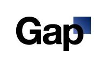
The new Gap logo
For over 20 years, The Gap brand has been recognized by the same logo; the letters “G A P” in white, over top a navy blue colored backdrop. Now, the company has decided to change their logo to the new one that is picture to the left.
It seems as though most of the feedback being posted on the internet and on The Gap’s Facebook page is negative.
Today the company posted the following message on their Facebook page:
“Thanks for everyone’s input on the new logo! We’ve had the same logo for 20+ years, and this is just one of the things we’re changing. We know this logo created a lot of buzz and we’re thrilled to see passionate debates unfolding! So much so we’re asking you to share your designs. We love our version, but we’d like to see other ideas. Stay tuned for details in the next few days on this crowd sourcing project.”
It looks as though, they are accepting the negative feedback on the new logo, and requesting that the internet community crowd source to create their own new Gap logo. There have already been hundreds of logos submitted to the company.
It should be interesting to see if one of them becomes the official Gap logo.
